project information
A bit Fform
Fform are a gym, but not the type you might imagine. There are no treadmills, spin bikes or machines. Those things are replaced by classes focusing on our physical bodies and emotional health. Fform empower their members to adopt fitness as part of their lifestyle by giving them personalised programmes covering emotions, psychology, physical fitness, and nutrition.
What they needed
They wanted us to create a new brand to communicate Fform’s mind/body ethos.
Our Approach
We used the symmetrical nature of the letters in the logotype to create a feeling of balance and structure. The circumpunct (the dot within the circle forming the ‘o’) represents the seed, spark, and focused thought.
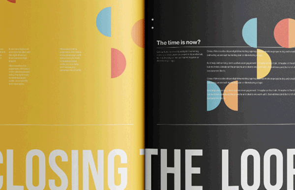
We applied the new identity across print, digital and environment. Although completed, the website launch is currently on hold due to a change in circumstances.
Disciplines
Branding, Digital, Physical, Print