project information
A bit about Colour Nine
Colour Nine is a boutique digital marketing agency who work on projects big and small, be it delivering an annual marketing plan or developing a logo.
They focus on high-quality, cost-effective solutions that deliver long-term audience engagement.
What they needed
To develop logo, visual style, promotional book and website.
Our Approach
We set out to create a simple logotype that would reflect the chaotic multisensory nature of the name ‘Colour Nine’. By flipping the two ‘N’s in the word nine, it disrupted its appearance just enough, whilst still being recognisible.
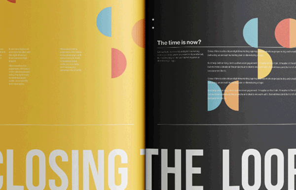
The promotional book carries the key message that invites their clients to ‘Stop Making Sense’. Discussing such issues as how brands need to flex in new and challenging ways in today’s ever evolving world.
This messaging was then rolled out across their website.
Disciplines
Branding, Digital, Print